
How Amazfit beacame the Oneplus of Smartwatches?

 The Smartwatch market in India is flooded with new devices each and every week. Brands like Boat, Noise, Fire - Bollt all together in a red ocean market, with each of them launching products all at a certain price segment mostly from Rs 1000 - Rs 5000.

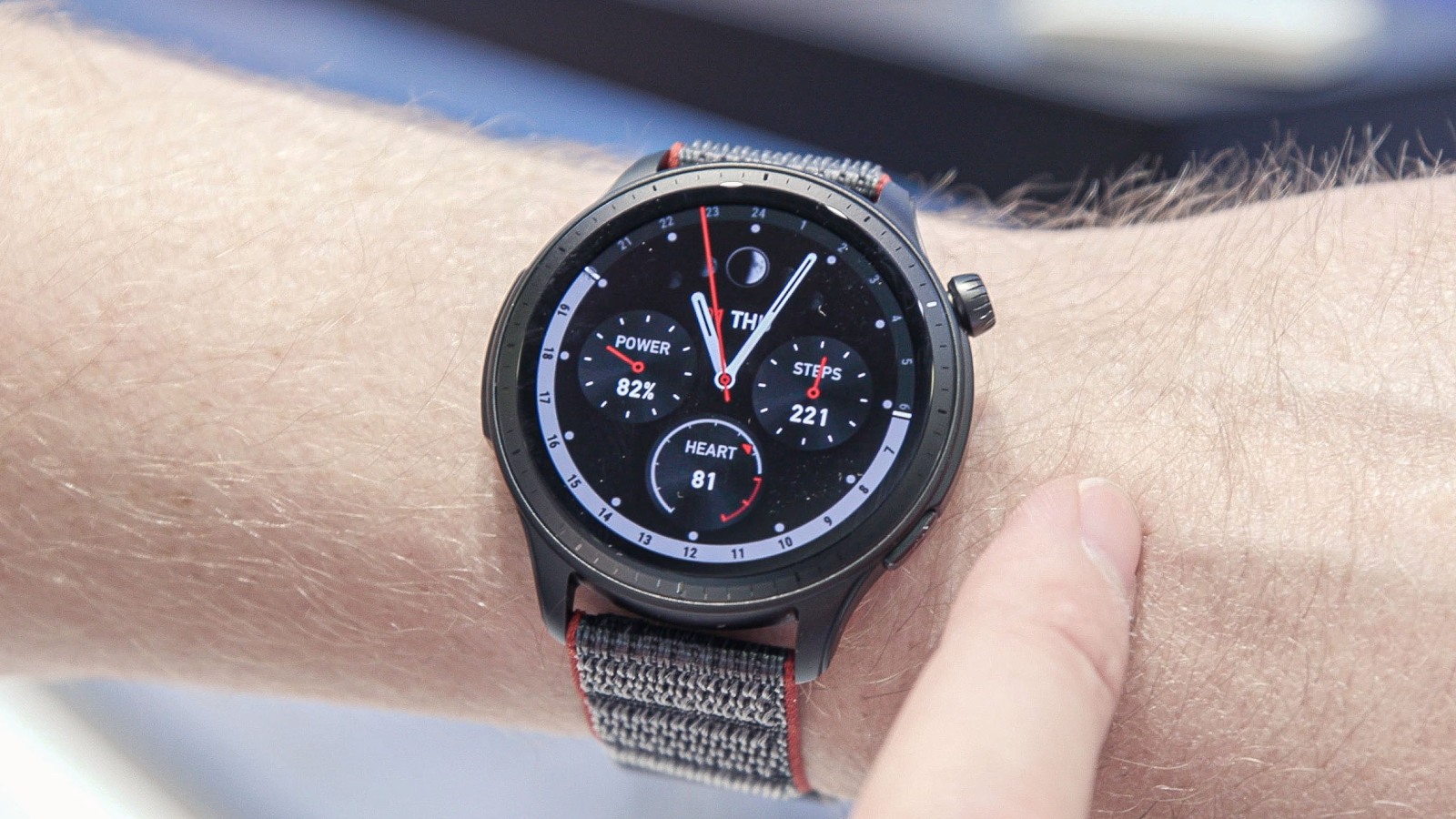
Then comes Amazfit whose starting segment is Rs5000. The brand targeted mid-range seeking customers. The thing is the quality of their products is with it. It is better than the competitors. From the band material to the app interface, all things are taken care of.


Amazfit is a smart wearable brand established in September 2015. Its products are manufactured and owned by Zepp Health. The brand offers wearable devices including smartwatches, fitness bands, and equipment related to health and sports. 


In January 2020, it attended the Consumer Electronics Show 2020 in Las Vegas. In the middle of October 2021, Amazfit updated its brand identity with the slogan "Up Your Game".


Comments

Popular posts from this blog

Branding 101

  Branding 101: An Interactive Learning Journey Branding 101 Foundations Core Identity Application Case Studies Foundations Core Identity Application Case Studies An Interactive Learning Journey Welcome to your hands-on guide to branding in the Indian market. Navigate through the modules to build your understanding from the ground up. Click on any lesson to reveal its core concepts. Module 1: The Foundations o...

Logo Design for - Revive Room

 Logo Design for *Revive Room* — A Sustainable Thrift Store  Project Overview **Client:** Revive Room (Local Thrift Store)   **Role:** Brand Identity Designer   **Deliverables:** Logo Design, Color Palette, Typography System, Mockups   **Tools Used:** Adobe Illustrator, Photoshop, Procreate (for texture), Canva (mockups) --- ## 🎯 The Brief Design a logo that reflects the essence of *Revive Room*, a new thrift store focused on sustainability, secondhand fashion, and community. The brand needed a modern, recognizable identity that stood out from typical thrift store aesthetics while staying true to its eco-friendly mission. The logo had to: - Represent the idea of “reviving” old items - Communicate sustainability and style - Be versatile across print and digital media - Feel approachable and trustworthy --- ## 🧠 Research & Inspiration Before diving into sketches, I researched: - Existing thrift store branding - Eco-friendly symbols (leaves, ci...